Posts by Doreen Vanderhart
The Daylighter

DAYLIGHTER: Branding for a Curated News Source


The night before a client launch day always feels like Christmas Eve around here. So much love goes into a brand design—not just from our side, but also from our clients.

You can peep through our work and get a glimpse of the final designs, but it’s hard to convey our favorite part of the entire project: the process. It might seem like design is just creating pretty things, but there is so much intention and strategy that happens behind the scenes. Here’s what that looked like for one of our all time favorite clients, The Daylighter!

wlc_portfolio_daylighter_primarylogo.jpg

When the owner of The Daylighter approached us, the site was called NYMHM—News You Might Have Missed. Needless to say, that’s a long name with a hard-to-remember acronym.

We went right back to the very beginning. Most global news sources are obscure, for a very niche audience, or very political. The Daylighter appeals to a broader audience, breaks through “cliches of coverage” and brings professionalism to this beat. A daylighter is someone who reveals information that is hidden, so it felt perfect for this brand. Short, sweet, catchy, and oh-so-appropriate.

Once we vetted the name (using our handy-dandy naming checklist), we jumped in with the moodboard. The client chose the “light touch” concept, a streamlined minimalist style and palette that plays up the concept of light and illumination.

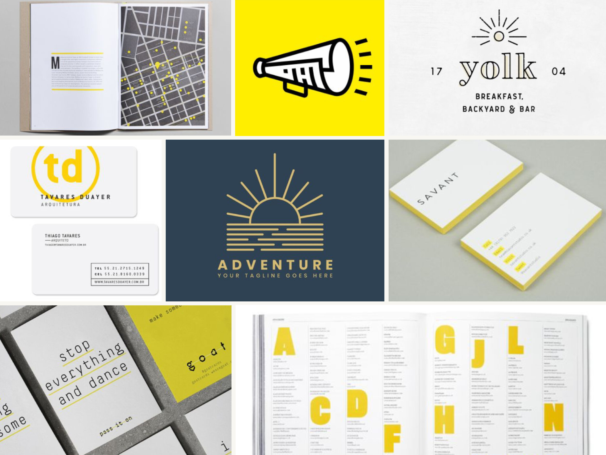
From there, we created a graphic that, like the original mark, played on the idea of journalism as sunlight—but it was simpler, bolder, and clearly representative of the concept. We paired it with a bold, angled typeface, suggesting progress and impact.

The site is still in the early experimentation phases of finding product-market fit, but Josh is one of our favorite clients and continues to turn to us for follow up design, branding questions, and related support.

Thanks for your incredible patience and client care. I am really, really, really pleased with your careful & deliberate process—I love every. single. thing. about it. Love the asymmetry, the color, the action, the boldness, the sleekness... everything.
— Josh Wilson, The Daylighter
wlc_portfolio_daylighter_colors.jpg
wlc_portfolio_daylighter_badge.jpg
wlc_portfolio_daylighter_website.jpg
Doreen Vanderhart
Noma City Terrace

Branding for a cosmopolitan real estate development


With every branding client we take on, we make it our mission to not only create a distinct visual identity, but also develop a system for how all of the design elements work together.

Not only does it mean your brand is polished and professional, it also makes it that much easier to work with. Noma City Terrace goes down as one of our favorite design projects because everything flows together so beautifully.

wlc_portfolio_nomacityterrace_primarylogo.jpg

When the developers of Noma City Terrace, a luxury townhouse development in downtown Greenville, SC, approached us looking for a brand identity, they were interested in bringing a more modern, minimalist architectural style to the area. They knew that it would appeal to a very specific audience—which is the smartest thing you can do when creating a brand.

We were instantly on board, because we know that being creative and unconventional is where the magic REALLY starts to happen!

We started with a kick off meeting to learn everything we could about the developer’s vision for the project and helped him zero in on the personality attributes and values the brand should convey. Then we moved on to moodboards and landed on a stripped back, sophisticated style in a palette inspired by natural materials. We nicknamed this concept “Scandinavian Surface,” as a response to the minimalist style of architecture. So good.

wlc_portfolio_nomacityterrace_moodboard.jpg

From there, we created multiple variations of the logo—a sleek, stenciled type treatment—for different applications, including the primary logo, secondary badges that the client could use on social media or in small spaces, and a lockup with the website address.

We also suggested fonts to complement the logo and built a simple Squarespace site to showcase the architecture and floor plans of the available units and collect leads from interested buyers. Finally, to take advantage of the development site’s location near downtown, we designed large scale signage for the fencing around construction site, featuring dramatic renderings of the modern architecture, to attract interest from foot traffic and drive people to the website.

wlc_portfolio_nomacityterrace_propertysign.jpg
Doreen Vanderhart
Hello Kitchen

THE HEART OF THE HOME: Branding for aN INTERIOR DESIGN FIRM

One of the coolest thing about entrepreneurship is the evolution. When you first get things off the ground, you have a general idea of what you want to do and which clients you want to serve, but that rarely remains the same as you gain experience…and that’s not a bad thing! Clarity (and subsequent growth) make us so happy.

That’s why it’s always a treat to work with folks who have spent a few years in business.

When the owner of Hello Kitchen, Erin Hanrahan, approached Working Lunch Co. to create a fresh new brand identity just in time for their 10th anniversary, we were thrilled. She is a creative business owner who understands the importance and value of a strategy-first approach and high quality design… plus, her business was small enough that we could work directly with her, which was a delight.

Erin met our founder Briana at a Creative Ladies Night, and then she came to a Lunch & Learn talk Briana gave on brand touchpoints for interior designers. A few weeks later we were having project meetings over açaí bowls at Blender&Bowl…which feels like a real novelty now that we’ve lived in COVID times!

wlc_portfolio_hellokitchen_blog_primarylogo.png

Hello Kitchen is an interior design firm, but there’s a twist—they do kitchens. Just kitchens. Gorgeous kitchens. (Kitchens that we want to…make our lunches in.) Their services are made more accessible by only doing design and selections, but no construction management.

Erin initially went through our Plan Your Brand program to clarify her vision for the company’s growth, zero in on the target client, and learn how to address their needs on an emotional level. She now has a clear vision, a concise elevator pitch, and an expanded messaging framework on which to base her marketing copy.

Oh, and there’s the visual side of things too.

We started with moodboards suggesting two possible directions—Polished Warmth and Relaxed Modern. Erin loved the vintage-inspired layouts and warm palette of the first concept, but ended up choosing a more modern typeface for the final logo.

We created some continuity with the original brand by incorporating a sophisticated green into the soft, fresh palette of muted citrus hues, earthy spices, and cool watery blues… so there’s plenty of variety to play with. So yummy!

hello kitchen a.png
wlc_portfolio_hellokitchen_blog_badge.png
As an Interior Designer, I had a vision for my brand design. What I didn’t have was the insight and knowledge to know how to research my audience, define my target market, and appropriately implement the branding into our business. Working Lunch Co. helped guide me through the client research so that our branding perfectly suits our business.
— Erin Hanrahan, Owner of Hello Kitchen
wlc_portfolio_hellokitchen_blog_colors.png
wlc_portfolio_hellokitchen_blog_stacked.png
Doreen Vanderhart
Ayucha

SCIENCE, WITH A PINCH OF YUM: BRANDING FOR BOTTLED AYURVEDIC TEA

If we had to choose one thing we love most about designing brands, we don’t know if we’d be able to do it. But we do know that somewhere near the top of the list would be differentiating each individual brand.

It’s a fun creative challenge to make each client’s brand completely unique. It helps when the idea behind the brand is special all on its own. Ayucha is on a mission to provide a drink that’s uncaffeinated and has wellness benefits, but is more tasty and refreshing than Kombucha.

They approached us to reinvigorate their packaging so that they could expand their retail partners with a brand they’re proud of. More access to this goodness? There’s something we can all get behind!

wlc_portfolio_ayucha_blog_primarylogo.png

The graphic, color-wash label style stands out among competitors that primarily feature photography on a white label background. These labels feel contemporary enough to attract the brand’s target of young, energetic, health-conscious customers.

Using minimalist, color block styles as our inspiration, we created a graphic version of a mandala that is the signature design element. Each flavor is represented by a subtle variation on mandala and a different color, so it’s easy to pick out on a shelf—but the basic structure allows for continuity across the brand.

We want people to feel motivated and healthy when drinking the product, but still connected to something ancient—much like the appeal of yoga. We also created a new tagline “The science of refreshment” to communicate the key properties of the drink: it’s based in ayurvedic science AND tastes great. All in all, this packaging design celebrates the brand’s ties to the ancient art and science of ayurveda without feeling old, traditional, or exotic.

Ayucha is modern, it’s accessible… and best of all, it’s delicious.

wlc_portfolio_ayucha_blog_amla bottle.png
wlc_portfolio_ayucha_blog_tulsi mandala.png
wlc_portfolio_ayucha_blog_hibiscus bottle.png
wlc_portfolio_ayucha_blog_amla mandala.png
wlc_portfolio_ayucha_blog_hibiscus mandala.png
wlc_portfolio_ayucha_blog_colors.png
wlc_portfolio_ayucha_blog_secondarylogo.png
Doreen Vanderhart