The Daylighter
DAYLIGHTER: Branding for a Curated News Source
The night before a client launch day always feels like Christmas Eve around here. So much love goes into a brand design—not just from our side, but also from our clients.
You can peep through our work and get a glimpse of the final designs, but it’s hard to convey our favorite part of the entire project: the process. It might seem like design is just creating pretty things, but there is so much intention and strategy that happens behind the scenes. Here’s what that looked like for one of our all time favorite clients, The Daylighter!
When the owner of The Daylighter approached us, the site was called NYMHM—News You Might Have Missed. Needless to say, that’s a long name with a hard-to-remember acronym.
We went right back to the very beginning. Most global news sources are obscure, for a very niche audience, or very political. The Daylighter appeals to a broader audience, breaks through “cliches of coverage” and brings professionalism to this beat. A daylighter is someone who reveals information that is hidden, so it felt perfect for this brand. Short, sweet, catchy, and oh-so-appropriate.
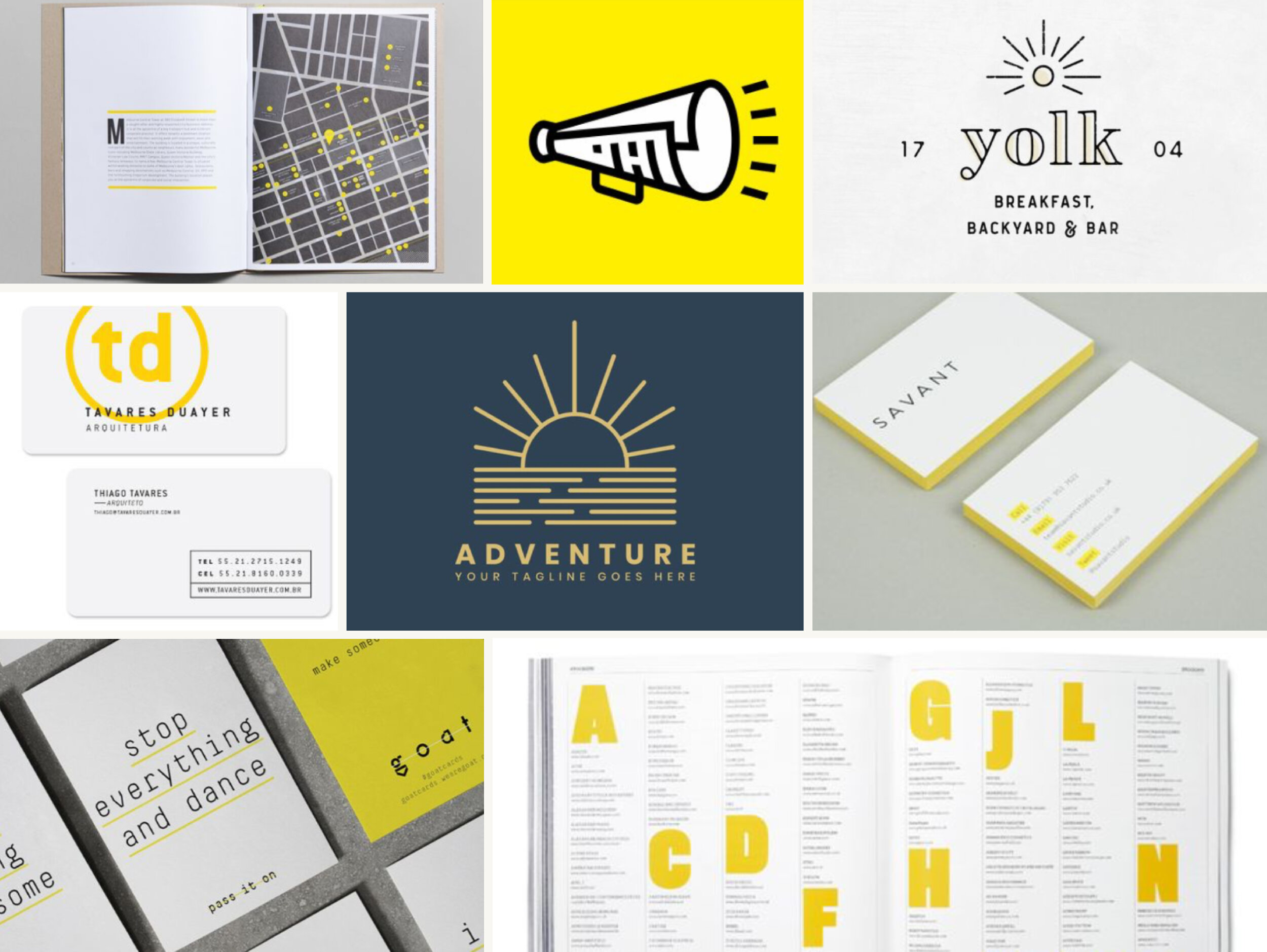
Once we vetted the name (using our handy-dandy naming checklist), we jumped in with the moodboard. The client chose the “light touch” concept, a streamlined minimalist style and palette that plays up the concept of light and illumination.
From there, we created a graphic that, like the original mark, played on the idea of journalism as sunlight—but it was simpler, bolder, and clearly representative of the concept. We paired it with a bold, angled typeface, suggesting progress and impact.
The site is still in the early experimentation phases of finding product-market fit, but Josh is one of our favorite clients and continues to turn to us for follow up design, branding questions, and related support.
“Thanks for your incredible patience and client care. I am really, really, really pleased with your careful & deliberate process—I love every. single. thing. about it. Love the asymmetry, the color, the action, the boldness, the sleekness... everything.”


