Hello Kitchen
THE HEART OF THE HOME: Branding for aN INTERIOR DESIGN FIRM
One of the coolest thing about entrepreneurship is the evolution. When you first get things off the ground, you have a general idea of what you want to do and which clients you want to serve, but that rarely remains the same as you gain experience…and that’s not a bad thing! Clarity (and subsequent growth) make us so happy.
That’s why it’s always a treat to work with folks who have spent a few years in business.
When the owner of Hello Kitchen, Erin Hanrahan, approached Working Lunch Co. to create a fresh new brand identity just in time for their 10th anniversary, we were thrilled. She is a creative business owner who understands the importance and value of a strategy-first approach and high quality design… plus, her business was small enough that we could work directly with her, which was a delight.
Erin met our founder Briana at a Creative Ladies Night, and then she came to a Lunch & Learn talk Briana gave on brand touchpoints for interior designers. A few weeks later we were having project meetings over açaí bowls at Blender&Bowl…which feels like a real novelty now that we’ve lived in COVID times!
Hello Kitchen is an interior design firm, but there’s a twist—they do kitchens. Just kitchens. Gorgeous kitchens. (Kitchens that we want to…make our lunches in.) Their services are made more accessible by only doing design and selections, but no construction management.
Erin initially went through our Plan Your Brand program to clarify her vision for the company’s growth, zero in on the target client, and learn how to address their needs on an emotional level. She now has a clear vision, a concise elevator pitch, and an expanded messaging framework on which to base her marketing copy.
Oh, and there’s the visual side of things too.
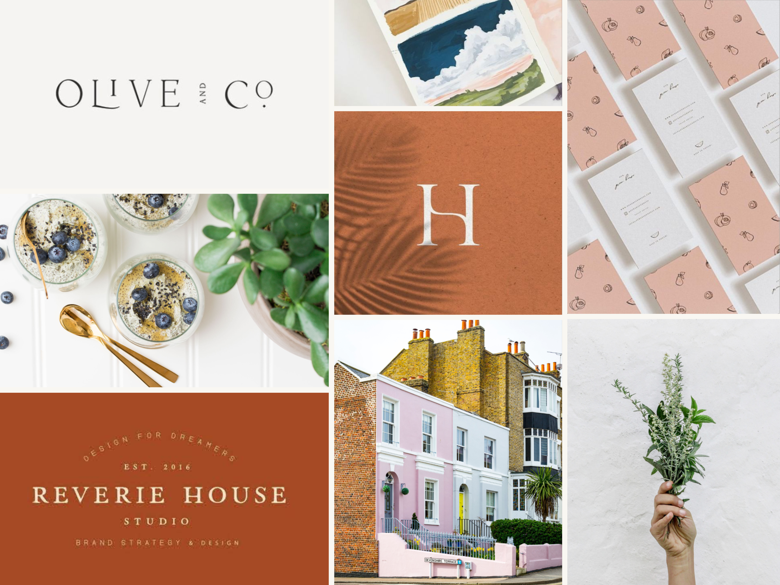
We started with moodboards suggesting two possible directions—Polished Warmth and Relaxed Modern. Erin loved the vintage-inspired layouts and warm palette of the first concept, but ended up choosing a more modern typeface for the final logo.
We created some continuity with the original brand by incorporating a sophisticated green into the soft, fresh palette of muted citrus hues, earthy spices, and cool watery blues… so there’s plenty of variety to play with. So yummy!
“As an Interior Designer, I had a vision for my brand design. What I didn’t have was the insight and knowledge to know how to research my audience, define my target market, and appropriately implement the branding into our business. Working Lunch Co. helped guide me through the client research so that our branding perfectly suits our business.”


